
UX Research, Web Design
Bios Lighting
UX Research, Web Design
Bios Lighting
UX Research, Web Design
Bios Lighting
UX Research, Web Design
Bios Lighting
ROLE
ROLE
ROLE
UX/UI Designer
TEAM
TEAM
TEAM
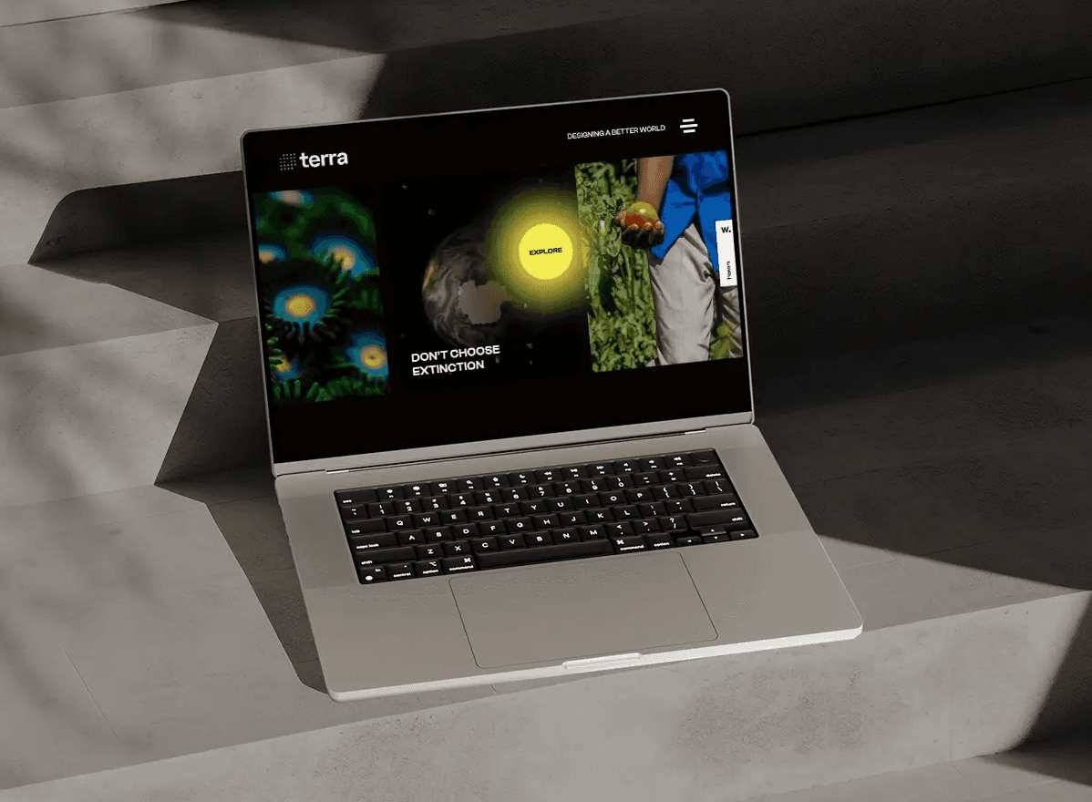
Terra Agency
RESPONSIBILITIES
RESPONSIBILITIES
RESPONSIBILITIES
Competitive Research
User Research
Wireframing Design
UI Design & Prototyping
QA Testing
Visit
CHALLENGE
CHALLENGE
CHALLENGE
Bios is a NASA spin-off company that develops biological lighting solutions to enhance human health and plant growth. Their old website was outdated visually and their users weren't engaging with the CTAs or product information like the company intended.
Bios is a NASA spin-off company that develops biological lighting solutions to enhance human health and plant growth. Their old website was outdated visually and their users weren't engaging with the CTAs or product information like the company intended.
SOLUTION
SOLUTION
SOLUTION
Creating a modern visual identity that mirrors the company's values while providing a user-friendly interface that conveys the complex information of BIOS' products in a clever and accessible way. The website was built in a modular approach in Wordpress, so it's easily edited by the client and sustainable over time.
Creating a modern visual identity that mirrors the company's values while providing a user-friendly interface that conveys the complex information of BIOS' products in a clever and accessible way. The website was built in a modular approach in Wordpress, so it's easily edited by the client and sustainable over time.
IMPACT
IMPACT
IMPACT
Frustrated emails dropped significantly, so the information was clearly more accessible and easily understood.
18% increase in contact requests (main CTA across the site).
78% improvement of performance, SEO and accessibility according to Google's dev tools.
Frustrated emails dropped significantly, so the information was clearly more accessible and easily understood.
18% increase in contact requests (main CTA across the site).
78% improvement of performance, SEO and accessibility according to Google's dev tools.
01 RESEARCH
01 RESEARCH
01 RESEARCH
BIOS' main challenge was the density of content across their website. With three distinct categories of highly technical products and an overwhelming number of pages, focusing on the sitemap and navigation structure became a key priority in this redesign.
To fully understand what was lacking on BIOS' website, we compiled the most common user complaints:
"I can't find my product's technical information."
"I can't navigate the website, either because it's slow or because it's confusing."
"BIOS has too many different products, and it gets confusing."
To address these issues, I also studied several competitors and noted how they handle navigation, sitemap, and information architecture challenges.
To address these issues, I also studied several competitors and noted how they handle navigation, sitemap, and information architecture challenges.

I used several user personas as a reference for the redesign, based on the client's feedback and my own research.
I used several user personas as a reference for the redesign, based on the client's feedback and my own research.


02 SITEMAP AND ARCHITECTURE
02 SITEMAP AND ARCHITECTURE
02 SITEMAP AND ARCHITECTURE
To create a new, user-friendly information architecture, I approached this project by dividing it into three areas: sitemap architecture, navigation redesign, and new sections for each page. This approach ensured that all decisions were made thoughtfully and that every issue was addressed.
I started by creating a user flow that served as the basis for sitemap and navigation proposals. I analyzed the shortcomings of the old structure and identified confusing categorization of elements, and an overwhelming number of incoherent pages, and then collaborated with the client and my teammates to develop a new, clean proposal that would allow users to easily navigate the site.

Miro board featuring the collaboration between client and design team to create the perfect user-flow / sitemap redesign.
Miro board featuring the collaboration between client and design team to create the perfect user-flow / sitemap redesign.
The final proposal ensures optimal navigation while significantly reducing the number of pages by merging content to create a coherent and seamless experience. Main elements, where user attention should be focused, were organized under clearly specified dropdowns, while secondary elements were relegated to the footer.
Once the pages and web structure were finalized, I moved on to proposing new sections for each page to ensure that the layout and information organization were clear from the start and thoroughly crafted.
Final navigation proposal

Final navigation proposal


New sections proposal for each page
New sections proposal for each page
03 WIREFRAME DESIGN
03 WIREFRAME DESIGN
03 WIREFRAME DESIGN
With navigation, sitemap and sections all laid out and fully clear, I moved on to designing wireframes for each page. The main focus was to keep the information as clear as possible and focusing on having an airy and friendly layout. During this process I could identify potential painpoints and created iterations to figure out what was the best way to convey all the information at hand
With navigation, sitemap and sections all laid out and fully clear, I moved on to designing wireframes for each page. The main focus was to keep the information as clear as possible and focusing on having an airy and friendly layout. During this process I could identify potential painpoints and created iterations to figure out what was the best way to convey all the information at hand

04 VISUAL IDENTITY + UI DESIGN
04 VISUAL IDENTITY + UI DESIGN
04 VISUAL IDENTITY + UI DESIGN
To create a compelling interface, I first needed to refresh BIOS' visual identity to convey their tech-savvy and innovative approach. I began by creating a fully fleshed-out style guide with new colors, modern sans-serif typography, and a bold new look featuring eye-catching neon gradients. Incorporating both dark and light modes was essential for how information needed to be conveyed, making the development of a consistent visual language crucial.
I also placed strong emphasis on product photography by incorporating brand elements into the images and carefully hand-picking each one.
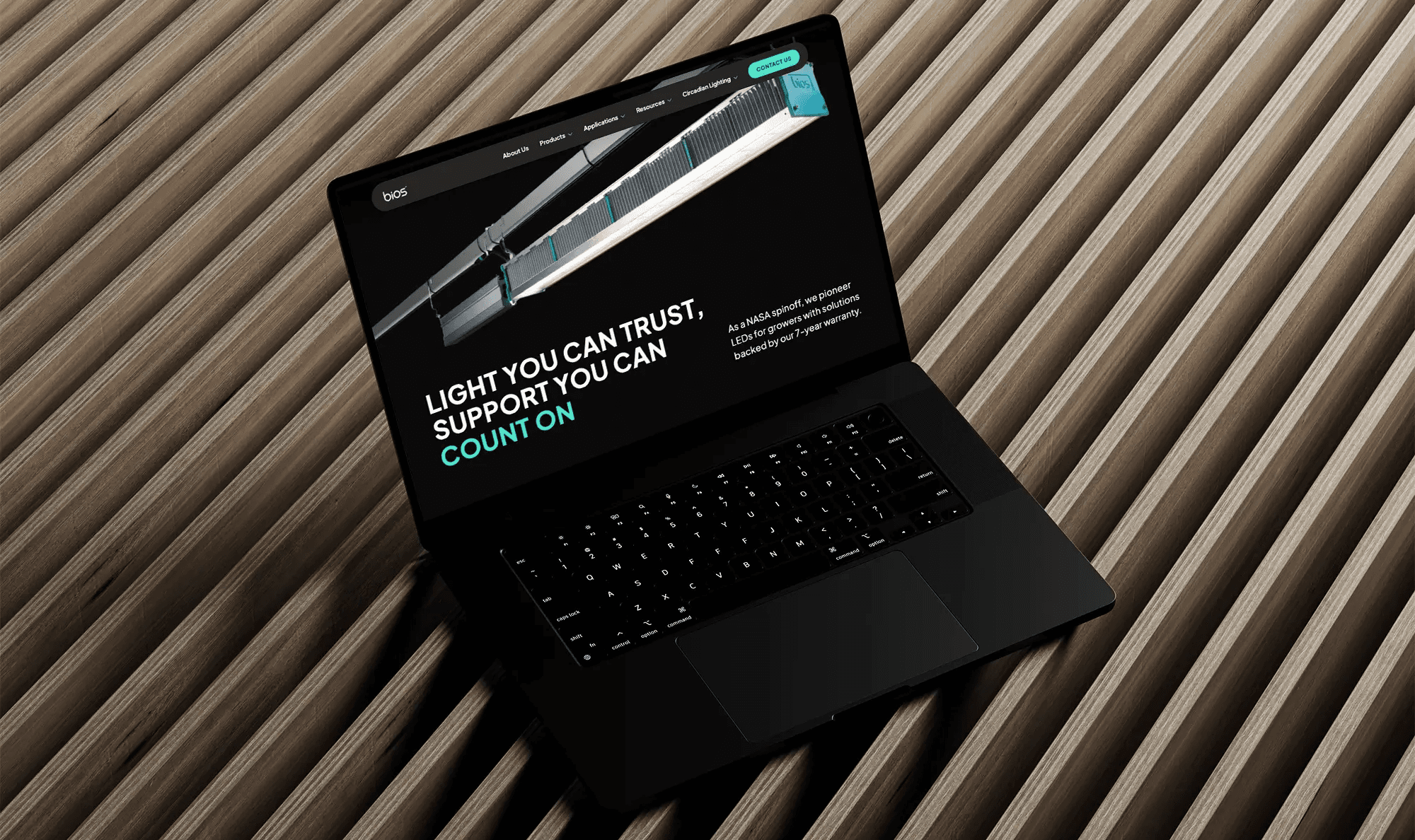
The final UI design clearly reflects the company's values and the design team's dedication to creating a website that is both extremely easy to use and visually distinctive. To create this design I produced a fully interactive prototype so the client, my development team and some testers could experience the website prior to developing it.
Feel free to explore the prototype here!
After the revamp, BIOS immediately stood out among competitors, distinguishing itself from other generic catalogs.

BIOS new homepage + some UI elements
BIOS new homepage + some UI elements

BIOS product page, where technical information is featured now at a glance, with heavy focus on a product comparison table
BIOS product page, where technical information is featured now at a glance, with heavy focus on a product comparison table

The website was also designed for mobile and tablet, making it fully responsive.
The website was also designed for mobile and tablet, making it fully responsive.
05 DESIGN SYSTEM + DEV HANDOFF
05 DESIGN SYSTEM + DEV HANDOFF
05 DESIGN SYSTEM + DEV HANDOFF
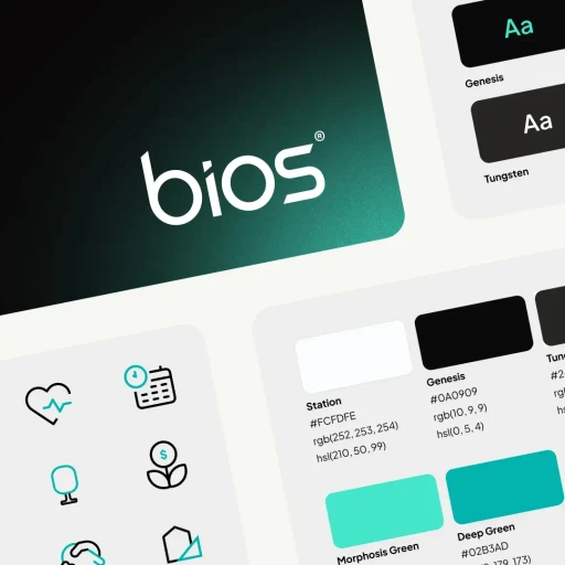
To ensure the project was executed seamlessly from start to finish, I developed a mini design system dedicated to the website to support a smooth developer handoff. I documented every component thoroughly, including interaction and animation notes, and double-checked that all colors and text met WCAG accessibility guidelines.
To ensure the project was executed seamlessly from start to finish, I developed a mini design system dedicated to the website to support a smooth developer handoff. I documented every component thoroughly, including interaction and animation notes, and double-checked that all colors and text met WCAG accessibility guidelines.

Snippet of some of the design system elements and a sneak peak at our dev-design notes.
Snippet of some of the design system elements and a sneak peak at our dev-design notes.
06 PROJECT SUCCESS AND CONCLUSIONS
06 PROJECT SUCCESS AND CONCLUSIONS
06 PROJECT SUCCESS AND CONCLUSIONS
Through close collaboration between the design team, development team, and PMs, the project was successfully launched after a series of QA tests and final checks. The results included not only a satisfied client but also a significant decrease in frustration emails, an increase in contact requests, and far fewer frustration clicks during interaction tests.
This project taught me the importance of thorough research in information layout and organization. The challenge of presenting complex, technical information could not have been solved without a deep understanding of user behavior combined with the application of solid design principles.
Numbers speak: data gathered after launch shows that the website redesign was a success!