
User Research
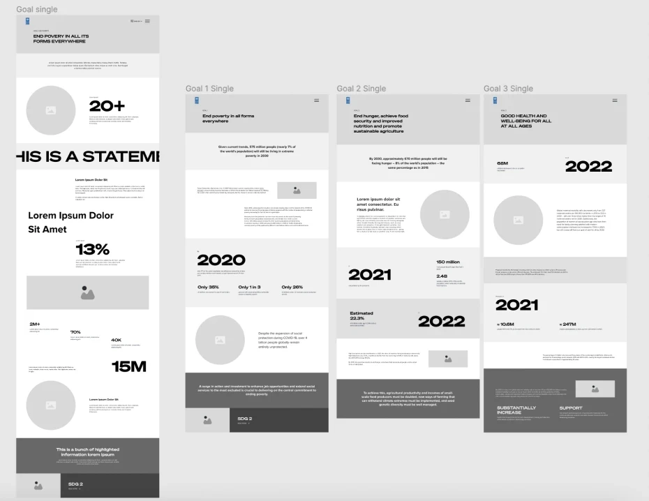
Wireframing Design
Visual Identity Development
Motion Graphics
UI Design & Prototyping
QA Testing
Visit
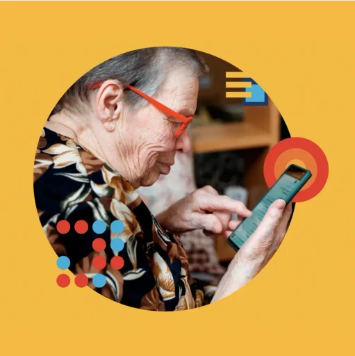
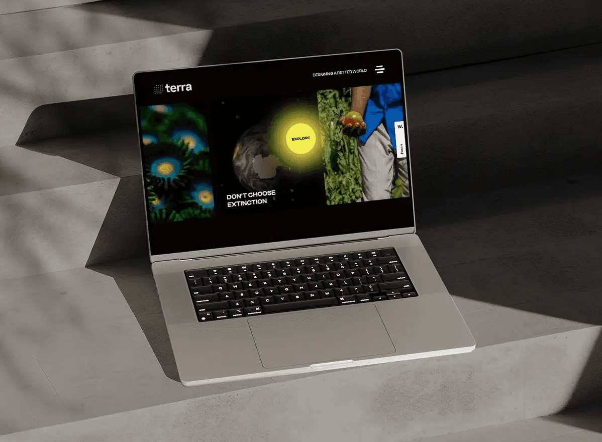
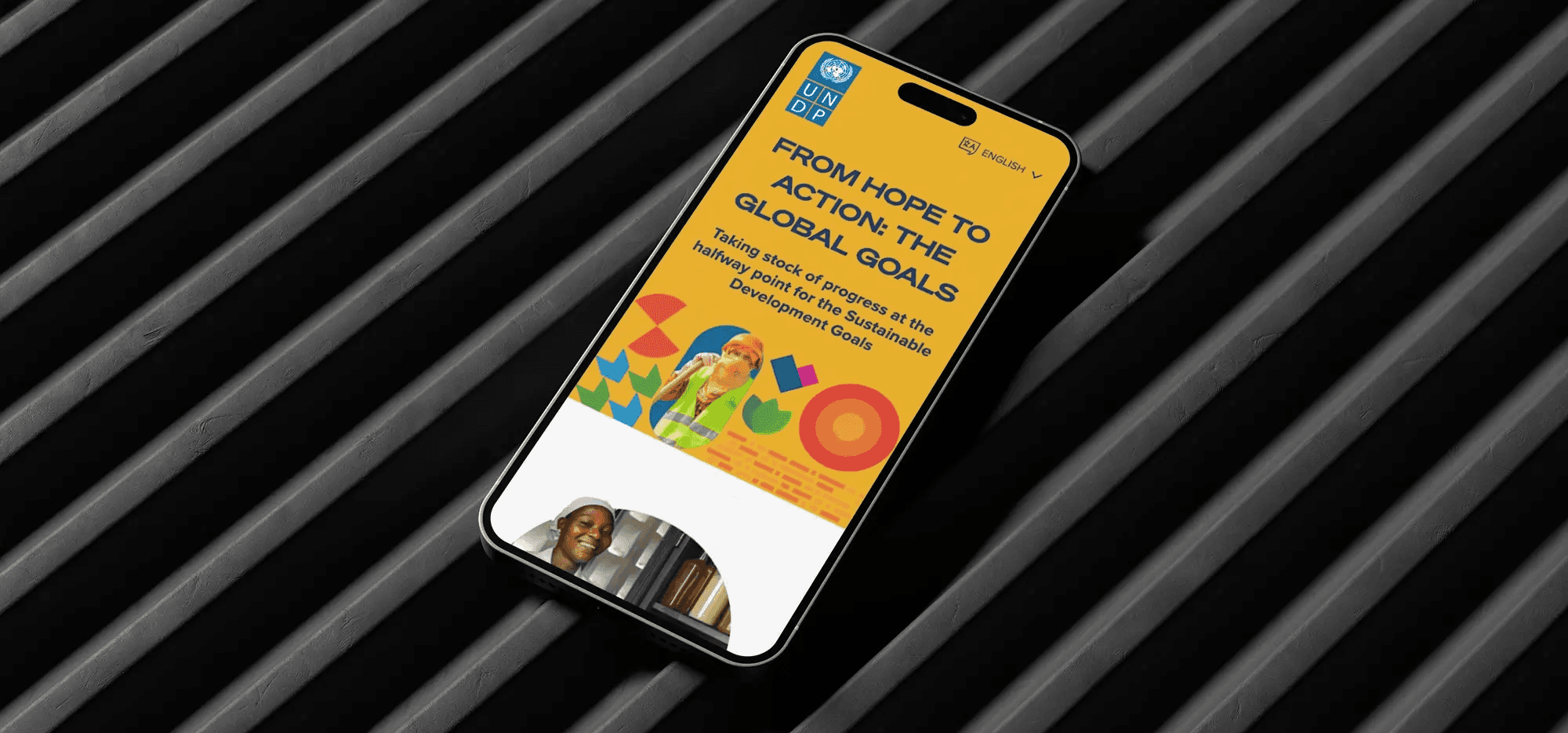
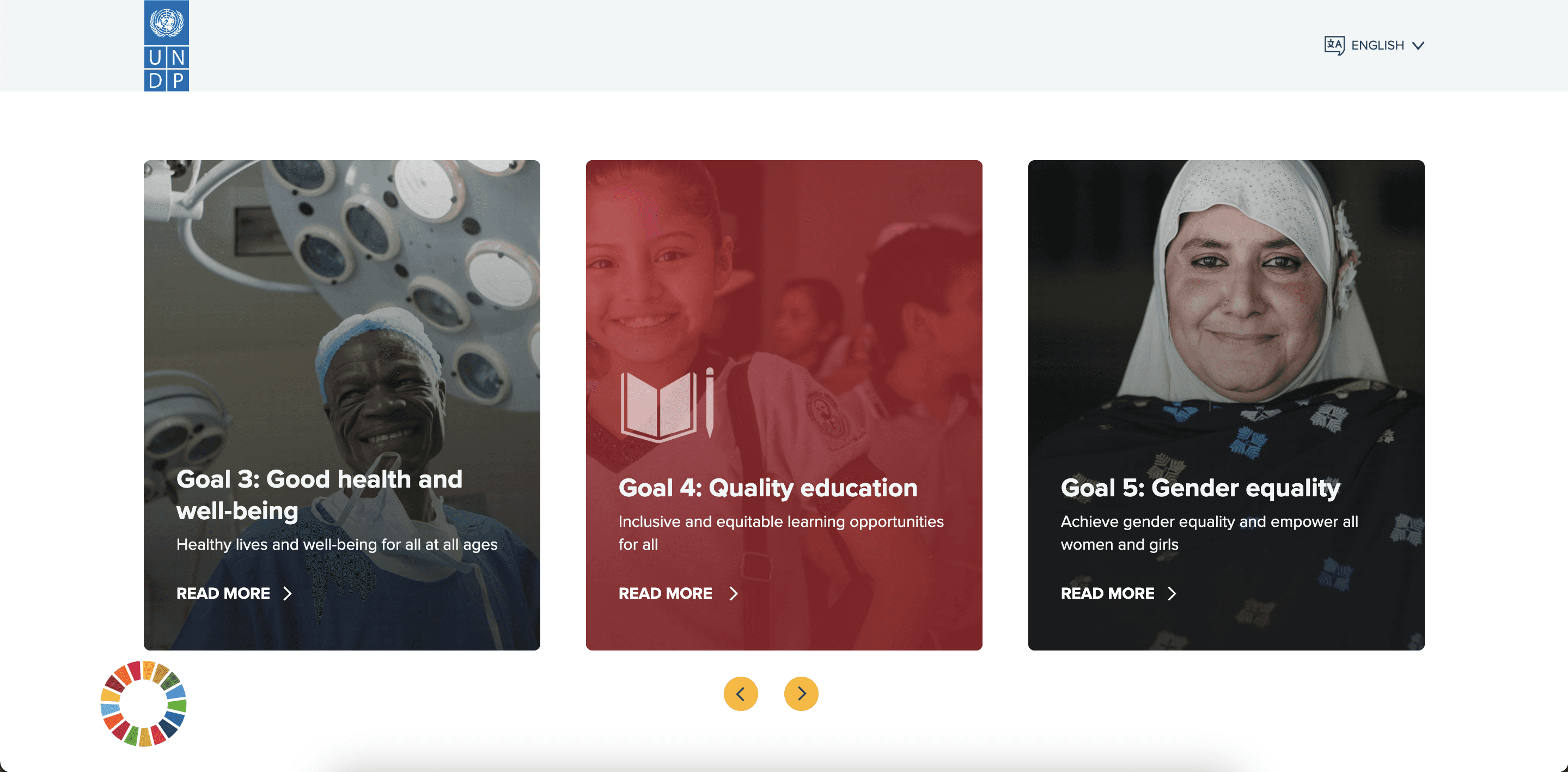
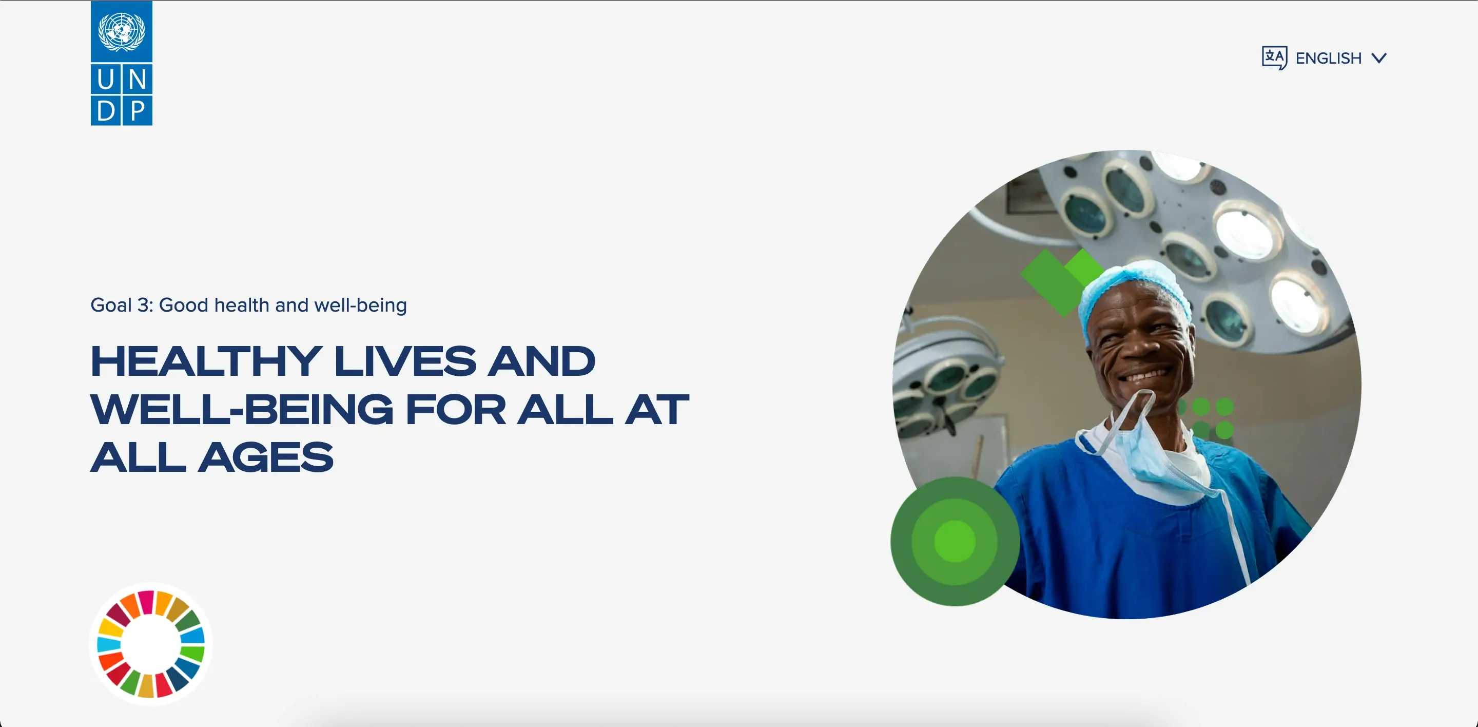
Illustrative icons were crafted to convey concepts related to the SDGs, which were later animated to give the brand a polished and warm feel. In terms of color, the original SDG colors were thoughtfully used to create unique palettes for each page of the report. This, combined with the distinct use of the icons, completed the visual identity as a custom and refined experience.

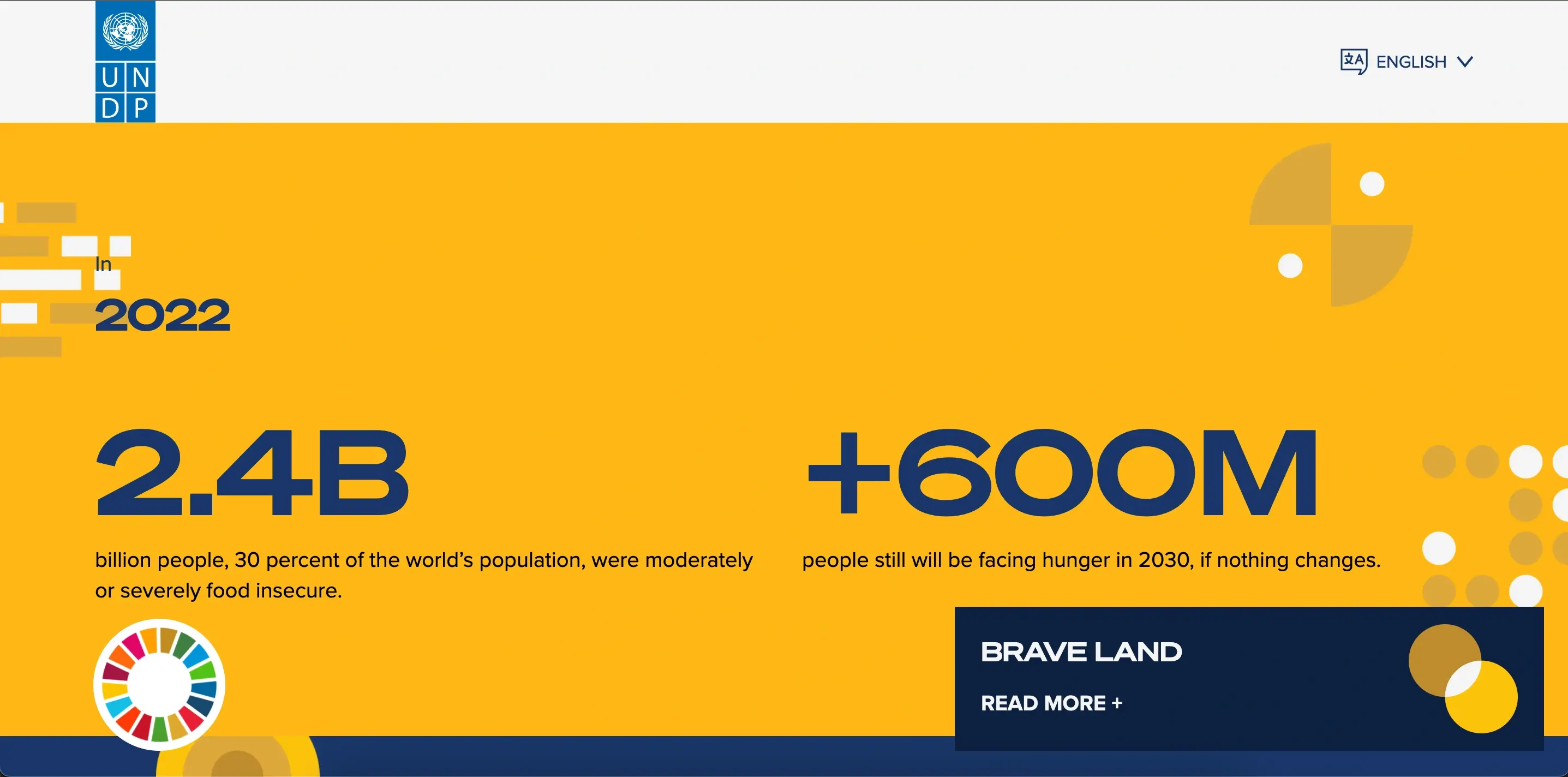
The result is a complex exercise demonstrating how useful and dynamic website design and visual development can be when representing extensive information.
Creating a modular, variable and adaptable project with over 20 pages with extensive information was a challenge we solved successfully by ensuring collaboration within different teams and clear communication with the client.
This project was featured in the front page of the United Nation's website, capturing huge user traffic and allowing us to further analyze the way people were interacting with the website to refine some bugs and design choices.