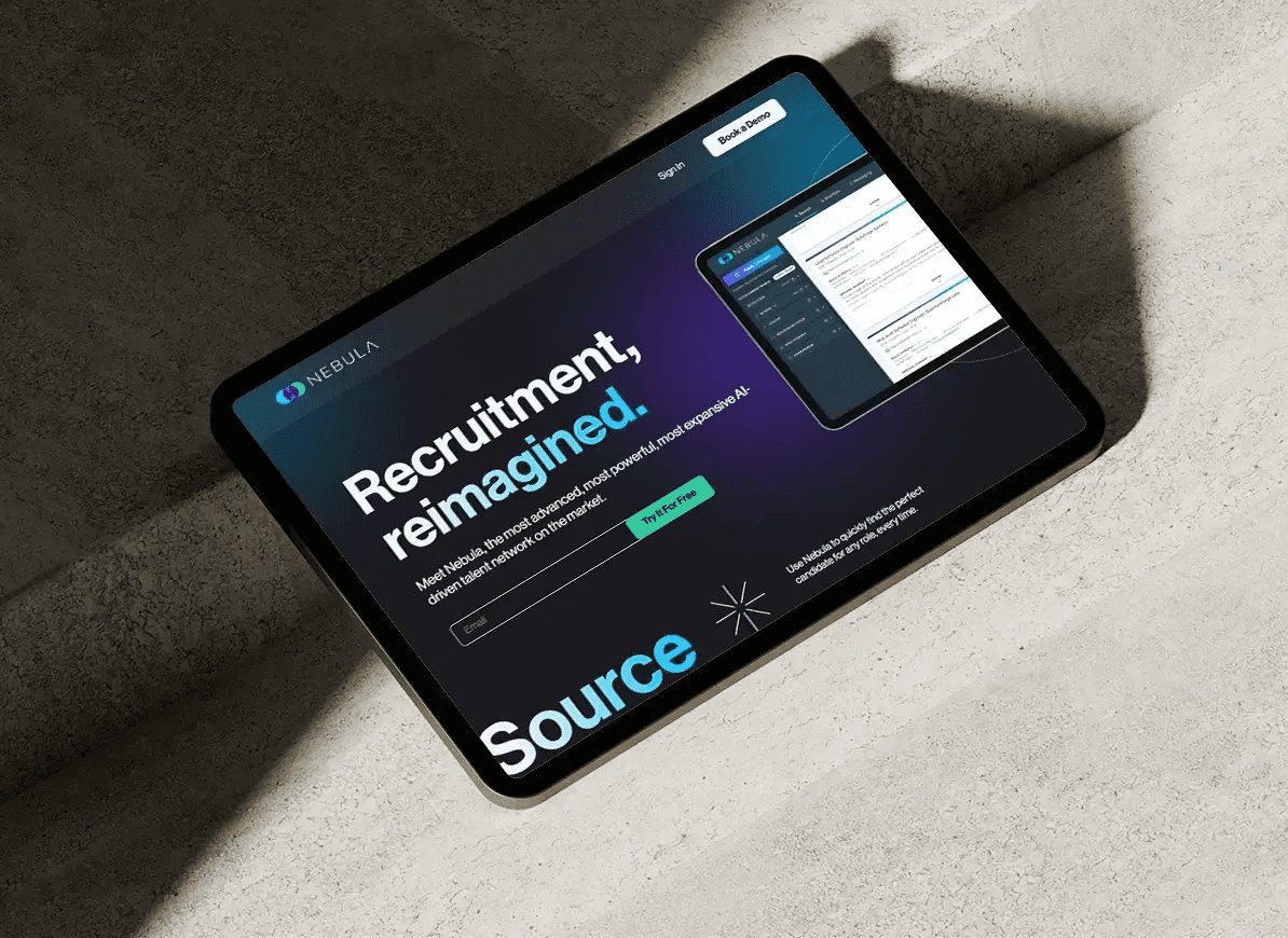
Web Design, Funnel Optimization
SUCCESS+ Funnel
Web Design, Funnel Optimization
SUCCESS+ Funnel
Web Design, Funnel Optimization
SUCCESS+ Funnel
Web Design, Funnel Optimization
SUCCESS+ Funnel
ROLE
ROLE
ROLE
UX/UI Designer
TEAM
TEAM
TEAM
Freelance - SUCCESS Magazine
RESPONSIBILITIES
RESPONSIBILITIES
RESPONSIBILITIES
Competitive Research
User & Data Research
UI Design & Prototyping
QA Testing
Visit
CHALLENGE
CHALLENGE
CHALLENGE
SUCCESS' self-growth subscription service was struggling with conversions and other user behavior issues on its landing page. The page failed to present content and pricing information clearly, leading to significant user drop-off.
SUCCESS' self-growth subscription service was struggling with conversions and other user behavior issues on its landing page. The page failed to present content and pricing information clearly, leading to significant user drop-off.
SOLUTION
SOLUTION
SOLUTION
The goal of the project was clear: to design a landing page that was not only eye-catching but also presented all crucial information in a coherent and straightforward way, guided by research into industry-standard competitors and design theory. Optimizing the rest of the funnel was also a main part of the project, amplifying Magazine sales and delivering excellent customer service.
The goal of the project was clear: to design a landing page that was not only eye-catching but also presented all crucial information in a coherent and straightforward way, guided by research into industry-standard competitors and design theory. Optimizing the rest of the funnel was also a main part of the project, amplifying Magazine sales and delivering excellent customer service.
IMPACT
IMPACT
IMPACT
17% increase in subscription sign-ups
+13 seconds average engagement time per user
44% decrease in rage and dead clicks
Balanced scrollmap, vs. previous user drop-off after the hero section
17% increase in subscription sign-ups
+13 seconds average engagement time per user
44% decrease in rage and dead clicks
Balanced scrollmap, vs. previous user drop-off after the hero section
01 RESEARCH & DATA ANALYSIS
01 RESEARCH & DATA ANALYSIS
01 RESEARCH & DATA ANALYSIS
SUCCESS+'s landing page showed clear issues with user retention and conversion, based on data from Google Analytics and CrazyEgg. Scrollmaps revealed that users were losing interest early on, while heatmaps highlighted poor CTA interaction and frequent misclicks.
SUCCESS+'s landing page showed clear issues with user retention and conversion, based on data from Google Analytics and CrazyEgg. Scrollmaps revealed that users were losing interest early on, while heatmaps highlighted poor CTA interaction and frequent misclicks.

Initial data analysis highlighting relevant issues
Initial data analysis highlighting relevant issues
In addition, SUCCESS+'s landing page was not following industry standards or best practices for content organization and layout. The page was too long, sections lacked clear value propositions, the pricing table was confusing, and buttons had no hover states. These issues made it evident why the page was underperforming.
To address this, I conducted a brief competitor and reference analysis, complemented by research into landing page conversion best practices. This process clarified the issues and helped me define a roadmap to tackle each pain point effectively.

Reference board with section notes and takeaways
Reference board with section notes and takeaways
To fully understand how to improve the funnel, I studied the product’s varied user personas and target audience, which revealed a set of clear needs:
Condensed, straightforward information – User personas didn’t have time to waste and valued efficiency.
Improved pricing table and clearer CTAs – Some personas were less tech-savvy and required intuitive, easy-to-use interfaces.
Enhanced visual identity, microanimations, and microinteractions – Personas expected a polished, high-end product experience.


While landing page strategy was cleared out, I also wanted to take a look at the rest of the funnel to figure out how to properly boost conversions. While I was researching this part of the project, I realized the checkout page needed some work in making the UI clearer to address the user dropout noticed at this stage.
While landing page strategy was cleared out, I also wanted to take a look at the rest of the funnel to figure out how to properly boost conversions. While I was researching this part of the project, I realized the checkout page needed some work in making the UI clearer to address the user dropout noticed at this stage.

Funnel study

Checkout page study
02 LANDING PAGE REDESIGN
02 LANDING PAGE REDESIGN
02 LANDING PAGE REDESIGN
With all the research serving as a solid foundation, I was ready to begin the design phase. I started by identifying the most crucial sections and content, determining how to condense them into a concise landing page. Then, I studied the SUCCESS brand to ensure that everything would be implemented in a visually appealing and clean manner.
With all the research serving as a solid foundation, I was ready to begin the design phase. I started by identifying the most crucial sections and content, determining how to condense them into a concise landing page. Then, I studied the SUCCESS brand to ensure that everything would be implemented in a visually appealing and clean manner.

Exploring creative ways to condense content without overwhelming the user was a primary focus of this UI redesign.
Exploring creative ways to condense content without overwhelming the user was a primary focus of this UI redesign.
The pricing table proved to be one of the main challenges of this project, so transforming its content into a more digestible and easy-to-understand layout was a key step in the process.

The pricing table proved to be one of the main challenges of this project, so transforming its content into a more digestible and easy-to-understand layout was a key step in the process.

Google Analytics showed that around 63% of users accessed the site via mobile devices, which is why significant time was spent ensuring the design translated seamlessly across different screen sizes.
Google Analytics showed that around 63% of users accessed the site via mobile devices, which is why significant time was spent ensuring the design translated seamlessly across different screen sizes.
The rest of the funnel was also redesigned based on the findings from the initial research. The checkout page was streamlined to present a clearer UI, with the primary focus on collecting the user's payment information. Subsequent funnel steps (the Magazine promotion and Thank You page) were adapted to maintain a coherent aesthetic aligned with the landing page, while emphasizing excellent customer care and a bold approach to promoting the Magazine.
The rest of the funnel was also redesigned based on the findings from the initial research. The checkout page was streamlined to present a clearer UI, with the primary focus on collecting the user's payment information. Subsequent funnel steps (the Magazine promotion and Thank You page) were adapted to maintain a coherent aesthetic aligned with the landing page, while emphasizing excellent customer care and a bold approach to promoting the Magazine.

03 PROJECT RESULTS & CONCLUSIONS
03 PROJECT RESULTS & CONCLUSIONS
03 PROJECT RESULTS & CONCLUSIONS
All of these design changes, combined with marketing, copy, and SEO efforts, resulted in a revamped landing page that not only elevates the SUCCESS brand and SUCCESS+ as a digital product but also demonstrated measurable improvements in both conversions and user behavior.
Through this project I learned the importance of metrics and strategic thinking when designing a highly converting landing page. No decision should be a coincidence, and keeping up with data and user research will elevate the product's results.
All of these design changes, combined with marketing, copy, and SEO efforts, resulted in a revamped landing page that not only elevates the SUCCESS brand and SUCCESS+ as a digital product but also demonstrated measurable improvements in both conversions and user behavior.


Scrollmaps and heatmaps indicate a more streamlined user experience compared to the confusing interface before the redesign, where CTAs were neither noticed nor understood, and user drop-off occurred at a high point on the page.
The scrollmap input is extremely interesting, as the pricing table (last element on the page) has the same popularity rate as the second element on the page, which means users are now getting to the main CTA and scrolling all the way through
Numbers speak: data gathered after launch shows that the funnel redesign was a success!